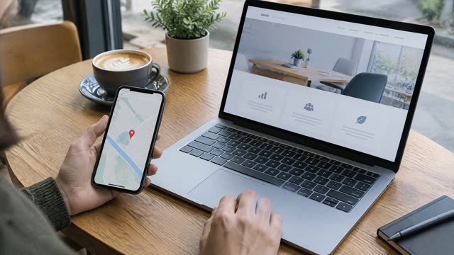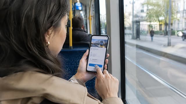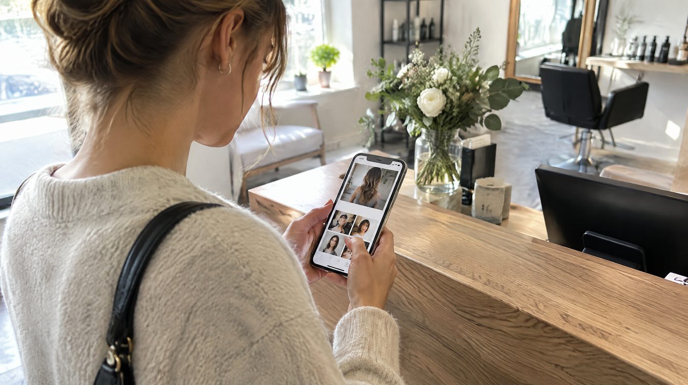
The first screen gets a few seconds
Someone opens your site on a phone, usually in passing. If in a couple of seconds they can't tell what you do, where you are and how to book, they go back to search. Everything important has to fit above the fold.
Five things for the first screen
1. What you do and for whom. One sentence: "Dental clinic in Dubai Marina", not "We care about your smile". 2. Where you are. A neighbourhood or street. A client from the other side of the city filters themselves out, and that's fine. 3. A booking button. Visible, with a verb: "Book now". Not "Learn more". 4. Proof. One number or rating: a Google score, years in business, clients served. Real ones only. 5. A photo showing the work or the place. A real one, not a stock handshake.
What to take off the first screen
- A slider that flips images by itself and hides the button.
- A popup covering the whole screen in the first second.
- A long welcome with no substance.
How to test it yourself
Open the site on your phone, step back and look for two seconds. Then answer out loud: what do they do, where, how do I book. If any answer needed a scroll, fix the first screen.
Checklist
- [ ] It's clear what the service is and in which city
- [ ] The booking button is visible without scrolling
- [ ] There's one real proof point: a rating, a review, years in business
- [ ] No popups in the first second
- [ ] The photo is real
What you can hand off to us
We build the first screen around booking in every landing page from $700. You can discuss a site for your own business.